Degree
Kinder Ready is meant to create an opportunity for dialogue and participation between parents and their children. I want to call attention not just to the formal aspects of what their child needs to be prepared for school, but also to the fun, interactive every-day experiences that can be presented as learning opportunities.
Kinder Ready begins as a linear assessment test with the purpose of grasping your child's skill level in five different areas of study. This test is determined by which school district the use is zoned for based on their location when they open the app, thus making sure that it is catered to the exact needs of each child as determined by their future school. After completing the test, parents then have the opportunity browse through suggested activities, local activities, or search for something specific from the data-based of both user-submitted and sponsored activities.
User-submitted activities are just a small portion of the community that exists within Kinder Ready. Users can connect with each other online through the forums or through social networks to ask questions, connect with others, and see what their friends are doing. Through saving and attending local events found through the app, parents can also connect with eachother (as well as allow their children to socialize) in-person. Building strong connections before even starting school can help parents and their children ease into the school life once they reach it.

Friday, April 27, 2012
Friday, April 13, 2012
An Inbetween Post - Inspiration
So, in the earlier stages of this project, I had done a bit of research involving existing iPad apps for parents with small children. By and large, I found apps that were meant for the children, not the parents. These apps are opened and the iPad/iPhone is handed off to the child to play as a game. In that way, these apps are different from what I am creating. BUT. They are relevant and informative. And I forgot to document them here earlier. Whoops.
Preschool: 15 in 1 Kids Pack


Zoo Train


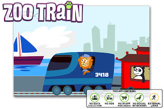 One thing that I enjoyed about the Zoo Train app was that it specifically stated that there was no social networking or data collection and no way to make in-app purchases. This is not necessarily something that my app shares, but the fact that this is made clear from the beginning pleases me, and I imagine it would be a relief for a parent. I attempted to look into whether this was some sort of children's app standard or rule, but from what I could tell it was something specific to this application. I could be wrong though.
Letters A to Z for the iPad from True Learning


 Clean and well rendered, but there's not a lot to do on this app. It is essentially an interactive alphabet. Fun to click, pretty to look at, but doesn't do much else. But hey, it doesn't take kids much to stay entertained.
Preschool: 15 in 1 Kids Pack


Zoo Train


Letters A to Z for the iPad from True Learning


11 week - Scenario 2 Complete, #3 on the way.
So, these are screens from the second scenario of my application, which involves exploring some of the activities sections. Specifically, the user searches the locally based activities, both indoor and outdoor. I had some struggles getting through this scenario, and found myself stuck scooting elements around and around the page. But many of my issues were resolved after talking with classmate Julie. Sometimes you just need to take a step back and ask for help.
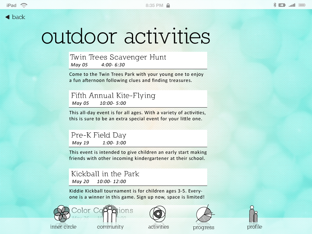
This page is an example of a local activity page. The user has a opportunity to read about the event, see which areas of growth are developed through this event, as well as the date, time and location. All of the time and location information can be saved to the iCal and Map applications, respectively. Many parents have busy schedules and it can be easy to overlook/forget events. This app tries to prevent that from happening by tagging events both within it's own calendar (which appears on the front/beginning page) as well as exports it to iCal. Yay for reminders!
The activity information pages also show who else is attending and comments/feedback. These elements of the app promote the community that is created by the parents and their interactions in the app.

Here's the map page from the front screen. Simple bold dots indicate bookmarked events/activities.

This is the activities search page. While in scenario #2 I choose to focus on the local activities feature, I also touch on how the non-time based activity search works.

 Note the difference between the top and bottom screens. The user can sort/filter through the search by selecting certain focus-areas. I need to come up for a better term for these categories for the sake of the presentation.


This page is an example of a local activity page. The user has a opportunity to read about the event, see which areas of growth are developed through this event, as well as the date, time and location. All of the time and location information can be saved to the iCal and Map applications, respectively. Many parents have busy schedules and it can be easy to overlook/forget events. This app tries to prevent that from happening by tagging events both within it's own calendar (which appears on the front/beginning page) as well as exports it to iCal. Yay for reminders!
The activity information pages also show who else is attending and comments/feedback. These elements of the app promote the community that is created by the parents and their interactions in the app.

Here's the map page from the front screen. Simple bold dots indicate bookmarked events/activities.

This is the activities search page. While in scenario #2 I choose to focus on the local activities feature, I also touch on how the non-time based activity search works.


Friday, April 6, 2012
10 - Week - Progress
Last week I had a bit of a setback, as I lost a bit of work due to a file corruption. Oops. Thank goodness for back-ups.
The first and most complex scenario is the assessment test. Initially I had gone along with a linear style indicated by the "timeline" of arrows along the bottom. After a group crit though, it was brought to my attention that the arrows look like buttons. They are not. You can see the new timeline version of the buttons below, the third screenshot.
Some of the changes based off the feedback I have gotten are not added into the scenarios yet. I decided that I wanted to wait until every page of the scenario is built, because it is much easier to drop in these changes at that point.


Working on the second and third scenarios goes a lot faster than the first, partly because there are several repeated pages. I love the action of just being able to duplicate a page and slide it in where ever it needs to go.
These scenarios are also different from the first in the way that they do not have a linear navigation, and where the "timeline" was before, there are now a selection of buttons which lead to different areas of the application. Making these buttons was fun!They indicate the "inner circle," "community," "activities," "progress" and "profile" pages.

 Too much color-coding? Maybe. I'll continue to design these pages and self-assess more critically. I'm finding that it is difficult to make this app look adult enough.
Like the little lightbulb character. I had him in some iterations. He's cute for kids, but again, this is an app for adults with children. Not for the children. Crap.


The first and most complex scenario is the assessment test. Initially I had gone along with a linear style indicated by the "timeline" of arrows along the bottom. After a group crit though, it was brought to my attention that the arrows look like buttons. They are not. You can see the new timeline version of the buttons below, the third screenshot.
Some of the changes based off the feedback I have gotten are not added into the scenarios yet. I decided that I wanted to wait until every page of the scenario is built, because it is much easier to drop in these changes at that point.


Working on the second and third scenarios goes a lot faster than the first, partly because there are several repeated pages. I love the action of just being able to duplicate a page and slide it in where ever it needs to go.
These scenarios are also different from the first in the way that they do not have a linear navigation, and where the "timeline" was before, there are now a selection of buttons which lead to different areas of the application. Making these buttons was fun!They indicate the "inner circle," "community," "activities," "progress" and "profile" pages.


Like the little lightbulb character. I had him in some iterations. He's cute for kids, but again, this is an app for adults with children. Not for the children. Crap.


Friday, March 9, 2012
Friday, March 2, 2012
7 - Week - Close to Getting Somewhere. Maybe.
So this week, I've developed a site map that will function to inform the scenarios, which I also made! In MX last semester, I made somehow ended up making a lot more screens than I actually needed, and considering the tight schedule I'd like to try and avoid that, hah.

After the group crit I feel that I need to spend some more tine reflecting on the format that these scenarios are going to present themselves in. Been thinking iPhone, but maybe iPad would be more suitable. It's moved in a direction that it doesn't need to be that portable. And the iPad could make itself more available to being used by children too. Not to make the app for children, but perhaps some of these hypothetical activities could be performed on the ipad. Right now the scenarios are not device-specific.
Scenarios
Scenario # 1 Setting up the profile
either mandatory set or of enter settings on their own?
- download, enter app (show the icon on the screen)
- enter assessment test. series of questions (based on the kindergarten screening)*will the parent do this or the kid?
- chart is produced showing strengths and weaknesses
- tap on certain areas to explain subjects/different categories
- go back to chart
- next screen, select areas of concentration, which will customize search results, tailored to child’s needs
- tap on activity gallery button
- search for an activity
- select one
- tap to see more information, read through it
- save it for later use
- as your complete more activities with your child, you can check your progress
Scenario # 2 Geographically-specific features
- open up app, go to the profile page
- select privacy settings
- turn on the “location-based” events
- go to activities section
- select the geocache tab. there you have the opportunity to select local areas (this would be like parks and playgrounds) that have been rated and reviewed by other parents
- scroll through the information, probably an image, a rating, and a button that would take you to user comments. Areas would also display a list of related activities that one could do while at the location.
- Can tap a location to save it to maps. You can prepare before you go.
- go back to geocache page, select social opportunities.
- view events such as library readings, and stuff like that
- can add events to iCalender
Scenario # 3 Being a part of a community
- I have a question! tap on the community button
- tap the search existing questions
- use keyboard to type keyword
- search
- didn’t find what I was looking for, so I tab the “pose new question button”
- type question and send, wait for a reply!
- while waiting, you can check out the community
- connect to friends who also use the app through facebook, your contacts, and the school that your kid is zoned for to find people to connect with
- subscribe to friends
- enter contacts, can message them, request to have a play date, look through their saved activities to see what they like
****Want to work in how to connect with school, and potentially create a link between teachers and potential new parent/students.
Friday, February 24, 2012
6 - Week - 2-24-12
Again? Yes, sorry. After the small-group critiques on Monday Feb. 20, I ended up in another direction than I was previously going. Well, not so much another direction in concept, but in form. The book has been dropped, which is a pity, but I understand the reasoning behind the suggestion. With the time allotted, it was a pretty ambitious goal. Mostly the reasoning behind creating this book was to organize all of the research that I collected. It wasn't just a couple websites that I pulled resources from, but a lot of different, legitimate sources! But of course, I can just make a place for all that in the process portion of this project. I don't want to seem like I'm not doing anything though, so here are a couple spreads that I had started from the now-retired book.

Whatever! Now though, I feel a little set back, so I've got to spend a lot of time catching up, concepting for the new form of this project. First: another schedule! Hopefully I'll be able to stick to this one with minimal changes in the future. I've also built a little "wiggle room" into this timeline, in case any bumps in the road come along. This is mostly because the shift in the direction, I am not quite as sure about how this is going to happen? No, that's not true. I am sure, of what I'm doing, I'm just not quite as confident in this area of work, so I've given extra time to work out any kinks and make it look the best it can be.

 For next week, I am going to spend a lot of time working out what functions I would like this application to have. I want to figure out all the experiences that it will encompass. This has also led me to thinking a lot about the form that this is going to take.
iPhone? Yes? Too default? Maybe? No.
I was hesitant to jump straight to doing an iPhone application, for the sole reason that it was an "easy" route to go. I want to make sure that what I create is informed by the content that will be in it, and I'm not just flaking out and going with the iPhone because it is the easiest solution. But the more I explore, the less it makes sense to create a whole new object, when the iPhone is a perfect medium to contain the functions. Perhaps speculative functions can be within the iPhone, rather than call for the creation of something completely new.


Whatever! Now though, I feel a little set back, so I've got to spend a lot of time catching up, concepting for the new form of this project. First: another schedule! Hopefully I'll be able to stick to this one with minimal changes in the future. I've also built a little "wiggle room" into this timeline, in case any bumps in the road come along. This is mostly because the shift in the direction, I am not quite as sure about how this is going to happen? No, that's not true. I am sure, of what I'm doing, I'm just not quite as confident in this area of work, so I've given extra time to work out any kinks and make it look the best it can be.


iPhone? Yes? Too default? Maybe? No.
I was hesitant to jump straight to doing an iPhone application, for the sole reason that it was an "easy" route to go. I want to make sure that what I create is informed by the content that will be in it, and I'm not just flaking out and going with the iPhone because it is the easiest solution. But the more I explore, the less it makes sense to create a whole new object, when the iPhone is a perfect medium to contain the functions. Perhaps speculative functions can be within the iPhone, rather than call for the creation of something completely new.
Subscribe to:
Posts (Atom)